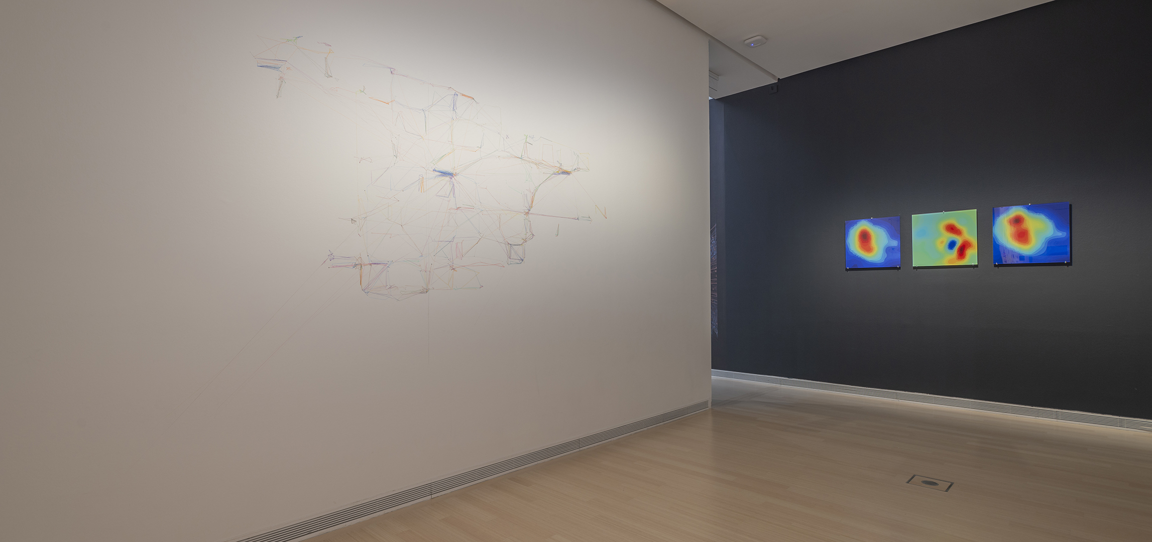
Barabási’s 2008 paper on human mobility caused the biggest uproar in his professional career. Featured on the cover of Nature, it relied on data recorded by a European cell-phone company to track and plot individual cell-phone users’ physical locations and trajectory in time. Its publication was the first time the broad public learned that their every move was being traced just by virtue of making a phone call, sending a text, or looking at something on the Internet—a rather upsetting realization for many people. The research captured thousands of individuals’ geographic movements by stringing together their real-time locations. The BarabásiLab explored these anonymized data sets and revealed the exceptional predictability of our daily routine. Using algorithms, the team could forecast a person’s future location with 93 percent accuracy. The large network diagram on the opposite wall shows the trajectories of multiple individuals whose collective movements span the vicinity of a whole country. The smaller diagrams by contrast trace the trajectories of three individuals, each with a different degree of predictability, as they move around a major city. In the same time period, one person visits four locations, a second visits about a dozen, and the third about a hundred. The space is partitioned into a Voronoi grid that captures the reception areas of each mobile-phone tower, the silent spy of our current era. These partitions illustrate the way space constrains our movement. In addition, the data reflects that just as our daily patterns are confined by the roads we travel, our socio-economic existence is yoked to invisible structures.
A decade before the COVID-19 pandemic, the BarabásiLab was using mobile-phone data to map the spread of newly emerging mobile-phone viruses, predicting their hidden transmission patterns. The nine images on the left document the infection hot spots in a certain area in Europe. Each of the Voronoi cell partitions captures the area of reception of a mobile- phone tower. The colors of the cells—red signifying the most prevalent spread, and dark blue the lack of infections—correspond to the percentage of infection in that region and foreshadow the viral-prevalence maps we have grown familiar with during the COVID-19 pandemic. The images, from top to the bottom, capture how gradually the viruses infect most of the population.
An interesting and current example of the use of data on human movement is the video shown in the room entitled The beginning of the 21st century, which depicts the mobility pattern of Manhattan, New York during the COVID-19 epidemic. It illustrates the daily rhythm of the mobility in the city, expanding the map when the city is full of people, and deflating it when the population abandons the city. The animation shows how our life has changed due to the epidemologics, and captures the “new normal”.
 BARABÁSILAB: HIDDEN PATTERNS
